Benefits of Branding the Lab
June 10th, 2018
As seen in Laboratory Design
 Labs aren’t just research platforms. They’re also workplaces for principal investigators (PIs), researchers, technicians, support staff and others who spend long hours and often weekends in these buildings and spaces. How their work environment looks, feels and functions is critical to the performance of the scientific organization. That’s why both institutional and commercial owners are beginning to embrace a notion of lab design that goes far beyond mere functionality. Key design trends include sustainability and healthy environments, which are shown to improve comfort and productivity, with benefits for the bottom line and the planet. Other lessons in workplace design are being considered, especially if they have demonstrated notable improvements in employee performance and retention.
Consider that PIs and researchers often spend long hours in the lab, often facing deadlines and other pressures that rival stressful occupations in law, medicine and finance. It only makes sense that a workplace that’s healthy, welcoming and inviting will produce benefits for breakthrough science just as in those other fields. Many of the elements of this strategy are highly cost effective. Amenities—artwork, showers, cafés and meeting spaces for informal collaboration—have been shown to create a more effective workplace. Sustainable elements such as ample natural daylight, outdoor views and natural finish materials like wood can make the workplace more desirable and enjoyable, too.
Yet, there’s another dimension to lab design that helps improve performance, reduce absenteeism and improve recruitment and retention efforts. It’s the use of organizational branding—environmental graphics, theme colors, logotypes and applied messaging—and it contributes to strengthening the organization and creating a stronger connection between the lab and the research team.
In a world that has seen a dramatic new paradigm for employee satisfaction emerge among companies like Apple and Google, a number of research organizations are applying ideas from non-science workplaces to their labs. The use of branding—often combining artwork, graphics and amenities—is found to help establish or reinforce an organization’s work culture and scientific mission. These branding techniques tend to require a relatively small investment compared to the costs of lab construction or benches and equipment; yet they can yield surprisingly powerful dividends, often including the accelerated achievement of breakthrough science.
Branded labs can impart a “message of culture” to visiting investors, benefactors and grant providers—a fact that is widely considered the main reason to add branding into a lab. Yet, there are other valuable internal benefits documented by research organizations who have recently implemented a branded environment, including:
- Improved employee satisfaction, morale and productivity.
- Enhanced recruitment and retention results.
- Greater awareness and positive views of the host research organization.
- Modest acceleration of measured achievement cycles.
 Resistance to environmental branding
In spite of the potential, the idea of branded graphics in a lab is jarring to some. Many people think of branded environments in terms of restaurant chains or retail spaces, like the Apple Store. It may seem counterintuitive that an organization not trying to cultivate a broad base of end-users or consumers should expend effort on branding built space.
This was true in the outgoing paradigm, which considered culture and brand separately: Brand was an entity’s outward, market-facing manifestation, while culture spoke to an internal expression of identity. The emerging approach blurs the distinction between these two, as workplaces are considered apt opportunities for messaging and identity reinforcement. To demonstrate how this works for research environments, consider one cost-effective case study that delivered specific and measurable benefits.
Stakeholders recently employed a branded environment approach at Yale Univ.’s West Campus Laboratory, located in New Haven, Conn. At the helm, a highly regarded PI recruited as director for a new institute provided the impetus for a focus on design and branding.
The new institute would occupy a former Bayer Pharmaceutical research space, acquired as part of the school administration’s expansion plans, necessitating a major renovation of the outdated facility. In the planning phase, the director engaged the New Haven-based architecture, art and advisory firm Svigals + Partners to help the institute create a unique space to match their mission and profile. The ideal environment would establish a clear identity for the group based on its “culture of goals and methods,” according to one team member. A flurry of excitement in the science world and media coverage surrounding the PI’s recruitment provided the energy needed to implement this unusual plan.
The lab design approach focused on just two top-level strategies for achieving a recognizable brand.
Planning
The director desired a workplace culture with a focus on collaborative effort. At the same time, the space had to help keep researchers focused on their work, creating a challenge for the architects to strike a balance between a familiar and stimulating atmosphere and a serene, productive one. Further complicating the solution, the institute consists of between nine and 12 PIs, each with up to 10 researchers—a total staff of about 80 researchers, each with a specific role.
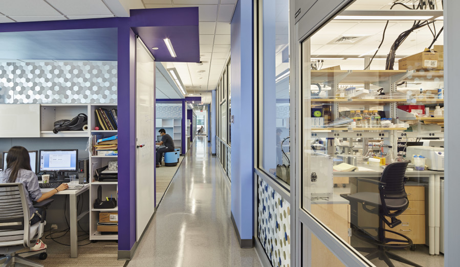
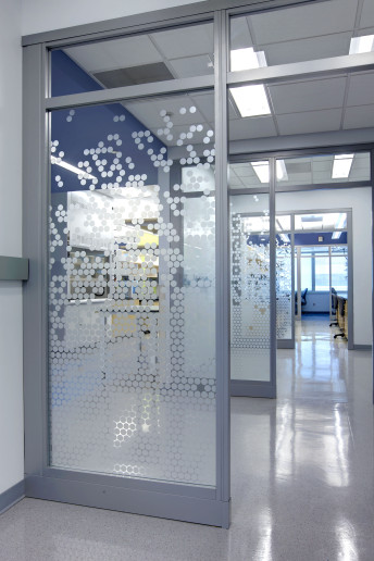
The design solution used sleek glass partitions to create subdivisions for each investigatory team. The use of glass separations both establishes an ongoing connection among teams and provides effective acoustic and psychological separation needed for focus. The glass also allows natural daylight to enter deep within the large floorplates.
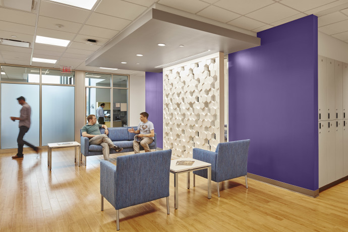
To nurture collaboration and idea-sharing among members of the various teams within the institute, the designers incorporated not only breakout spaces and lounges, but also “write-up walls” with display boards researchers can use to record ideation sessions. Write-up wall notes can then be excerpted and transferred for use later in formal meetings, conferences, events and other forums, making the breakout spaces, and time spent there, materially productive.
Identity
The design also incorporated a significant amount of integrated artwork—permanently built into the architectural elements—for the establishment of an identity, or a group culture. The graphic theme is based on a chemical formula, abstracted yet explicable to guests and new staff members, that was placed throughout the space using fritting on glass. This theme is a subtle and enjoyable reminder of the institute’s purpose, but more important the graphic is placed prominently, facing the elevator doors where it greets staff and visitors as they arrive. This establishes the brand identity and its visual theme immediately, and other placements of the graphic elements reinforce the theme throughout.
More branding case studies
The approaches are neither unfamiliar nor costly to employ. What makes them effective in delivering a branded lab environment is how they are employed strategically, through a detailed pre-design planning phase. This is particularly true of the integrated artwork, which can account for less than 3% of the overall design cost, yet effectively creates a source of pride for staff. Employees and employers in general like to display what they do. But how the organization displays its work is essential to the creation of a brand.
This concept was reinforced in the design of another research institute at Yale Univ.’s West Campus. Bringing together researchers from biology, chemistry, geology and other disciplines to develop potential new energy resources, the institute’s mission and method are sources of group pride. In the proposed design of the research space, the project architects found simple ways of displaying the prideful sentiments and generating excitement by incorporating the group’s new logotype [or “visual identity”] into environmental graphic elements throughout, and even fashioning it from an architectural element, a prominent entryway. Another advantage of this identity reinforcement tactic is it encourages visitors to ask questions, which makes the brand forward-facing rather than internal only.
For corporate research entities, brand and culture may be paramount. One major beverage and snack producer chose to incorporate branding elements into a new R&D facility in New York’s Hudson River Valley. The interior renovation project was completed on an accelerated schedule and tight budget, yet didn’t sacrifice identity. The programming formed a single common area at the joint of an L-shaped plan, combining the employee lounge and the security and reception areas. The design team could thereby concentrate graphics and integrated artwork in that space, where it would have the greatest impact—reinforcing culture to employees at rest, and introducing the brand to visitors.
This is no different from other businesses, in that the groups have to come up with a business model. Researchers may not all be business-minded, but PIs have to manage money, develop ideas and monitor resources.
For many research organizations, especially startups, branded space may not seem as important as effective space. This is true, but there are many ways to capitalize on cost-effective design aimed at goals related to identity and culture. These methods deliver enhanced outcomes, especially when they are incorporated into the earliest stages of planning. For those looking for an entry-level approach to lab branding, consider these perspectives:
- Character. The layout of work carrels, benches, desks and break space can send a message about the organization’s culture, simply because groups often see the effectiveness of approaches differently. Some want privacy and compartmentalization, whereas others favor blurring the line between workspace and breakout space. Working closely with the designer in the pre-design project phases supports maximum effect of this strategy.
- Prestige. Some firms consider prestigious atmosphere as a priority, believing that it makes a favorable impression on investors and benefactors while helping to attract top research talent. People often look for the “cool, exciting” place to work. Design can provide a competitive advantage, and an air of prestige need not be costly—which is good, since even startups need to recruit effectively. Elements such as natural daylight and biophilic finishes combined with cost-effective amenities like good coffee and comfortable furniture in break areas go far toward creating the “prestige lab”—although there is no substitute for great scientific research.
- Flexibility. More labs are opting for flexible bench and casework designs, rolling cabinets and plug-and-play “pods” for resources like water, gas and electricity. Flex-labs allow for growth, movement, easy expansion and fast relocation, while reducing construction costs associated with changeovers. Additionally, opting for this new lab planning paradigm demonstrates a current, up-to-date identity and culture. Permanence conveys a dated, less prestigious quality.
- A “home” for research. For those firms who wish to encourage extended working hours, creating an inviting atmosphere is essential. This incorporates all of the elements mentioned above, as well as those that help the research space function as living quarters: kitchen/food service, showers and even beds.
- Sustainable design. As previously mentioned, sustainable lab design helps the triple-bottom line. Note that being visibly sustainable can add to the prestige factor—especially for scientists, who are largely predisposed to prefer a green, energy-efficient workplace. Bike racks and recycling programs can go a long way in this regard, and cultivate planet-stewardship as part of the brand.
Finally, smaller research groups trying to compete with bigger institutions should consider a multi-phase timetable. Such was the case in the recent revamp of the New York Medical College research spaces. Working with faculty, the design team realized an important goal for the update: to create a lab without assignments. The architects started small by utilizing a few thousand square feet to create a prototype.
The design gutted the old lab, created a completely new layout with flexible furnishings and more access to windows for daylight and exterior views. The layout also remedied the previous lack of support spaces, while providing collaborative breakout areas, a coffee station and more. Simple organization completely altered the feel of the facility. Where corridors had been used for fridge and freezer storage, the new programming included a dedicated tissue culture room and separate equipment room.


